How Gambling App Design Can Hide Dangerous Game Mechanics

Digital gambling apps process millions of bets every day, and research shows that visual cues strongly influence how players judge risk and reward. Colors, motion, and layout can shape emotional responses before a user reads a single rule or odds table.

Open a modern gambling app and the experience often feels closer to a casual game than a betting platform. During account access, even something as routine as the mzplay login is wrapped in friendly colors, smooth animations, and playful icons. These choices set the tone early, suggesting ease and entertainment rather than financial risk.

Color palettes that calm the mind

stylized gambling app interface

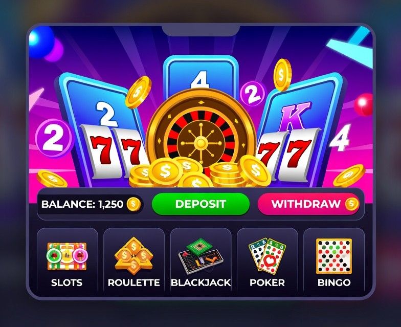
Color psychology plays a major role in gambling app design. Soft blues and greens are commonly used because they signal safety and trust. Warm golds and reds appear during wins, adding excitement and a sense of reward. Loss screens, by contrast, are often muted or brief, reducing emotional impact.

This balance matters. When losses appear visually gentle, players may underestimate how often they occur. Over time, repeated exposure to calming palettes can reduce stress responses, making it easier to continue betting without pause.

Animations that soften losses

Animation is another powerful tool. Chips slide smoothly across the screen, cards flip with flair, and numbers roll upward during payouts. Even when a bet fails, the transition is quick and polished. There is rarely a hard stop or stark visual that forces reflection.

Game designers borrow these techniques from mobile gaming, where flow and continuity keep users engaged. In gambling apps, that same flow can blur the line between entertainment and financial decision making.

User interfaces that hide complexity

High-risk betting systems are complex, but app interfaces often simplify them into clean buttons and clear paths. Odds are tucked behind small icons. Probability details require extra taps. What stands out instead are large play buttons and highlighted bonus offers.

By reducing visible friction, apps make betting feel effortless. The absence of clutter gives a sense of control, even when outcomes are driven by chance. This design approach can lead players to act quickly rather than think critically.

The playful aesthetic of chance

Many gambling apps lean into playful art styles. Cartoon mascots, celebratory confetti, and bright themes frame betting as light fun. This aesthetic lowers perceived seriousness, especially for younger users familiar with casual games.

When chance is presented as play, risk feels smaller. The emotional tone suggests that losing is part of the fun, rather than a real financial setback.

Why perception matters

Visual design does more than decorate an app. It shapes how players feel about money, time, and outcomes. A friendly interface can encourage longer sessions, higher stakes, and faster decisions.

Returning users often recognize familiar visuals during repeat visits, whether browsing games or completing another mzplay login session. That familiarity builds comfort, and comfort can reduce caution.

Design ethics and player awareness

There is growing debate among designers and regulators about ethical boundaries. Some argue that visual clarity and enjoyment are part of good user experience. Others warn that hiding risk behind art crosses a line.

For players, awareness is key. Recognizing how colors, animations, and layouts influence emotion can restore balance. Pausing after losses, checking odds, and setting limits help counter the pull of polished design.

Read also: The Art of Risk: How Jili Slots Fuel Creative Courage in Artists

Seeing past the surface

Gambling apps are carefully crafted experiences. Every visual choice serves a purpose, guiding attention and shaping perception. Understanding this design language helps users make more informed decisions.

Visual art in gambling isn’t just decoration. It frames risk, masks loss, and encourages play. The next time a screen lights up after a spin or a mzplay login opens a world of color, it is worth remembering that beauty can distract from dangerous odds.

The Art of Risk: Visual Design and Decision-Making in Online Gambling

gambling app interfaceMost online gambling decisions are made in seconds, and studies show that visual cues often guide those choices before odds or rules are read. Color, spacing, and layout work together to shape how risk feels. A calm screen can lower tension, while bright highlights can create urgency. This design layer is not decoration. It is part of how gambling platforms communicate with users and frame each decision.

This is where review and guide sites play a role, because they translate complex platforms into visual stories. Sites like Suprema Bet app pages use screenshots, clean layouts, and structured sections to show what a gambling platform feels like before a user signs up. The design does more than explain features. It suggests order, control, and a sense that risk is organized rather than chaotic.

Design as a First Signal of Trust

When a user lands on a gambling page, design sends an instant message. Neutral backgrounds suggest stability. Consistent fonts suggest clarity. Icons and badges suggest safety. These signals matter because risk is easier to accept when it feels familiar. Review sites lean into this by avoiding clutter and focusing on balance. White space, clear headings, and simple icons help users feel guided instead of pushed.

Images also play a part. Photos of live sports, casino tables, or mobile screens show activity without showing loss. The absence of negative imagery is intentional. Risk is framed as a controlled experience, something that can be managed with the right tools and choices.

Color Psychology and Emotional Flow

Color is one of the strongest tools in gambling design. Green is often linked to success and progress. Blue suggests calm and trust. Red is used carefully, often limited to alerts or key buttons. Review platforms mirror this logic. They highlight bonuses or features with warm tones while keeping the rest of the page calm and readable.

This creates an emotional flow. Users scan calmly, pause at key points, and feel guided toward action. Risk does not disappear, but it feels framed. When users read about betting limits or payment options, the steady design keeps anxiety low and attention focused.

Structured Reviews as Visual Storytelling

Structured reviews turn complex platforms into clear narratives. Sections like platform overview, payment methods, bonuses, and usability act like chapters. Each part answers one question at a time. This pacing matters. When information is broken into steps, users feel more in control of their decisions.

On pages discussing platforms such as Suprema Bet app features, tables and bullet lists help reduce mental load. Users do not need to search for details. Everything feels placed with intent. This structure transforms risk into something that feels measurable and understandable.

Design That Makes Risk Feel Creative

Some gambling designs lean into creativity. Dynamic graphics, smooth animations, and mobile-first layouts suggest innovation. Risk becomes part of a modern lifestyle rather than a cold calculation. Review sites reflect this by using clean visuals that echo app interfaces. Readers can imagine the experience before they try it.

This visual preview lowers barriers. When users feel they already understand how a platform works, the leap into real betting feels smaller. Design does not remove risk, but it reshapes how that risk is perceived.

EXPLORE MORE: Street Art Meets Protest – The Rise of Hazard-Inspired Installations

Why This Matters to Players

Understanding design helps users make better choices. When readers see how layout and imagery guide emotion, they can slow down and think. Review sites act as a buffer. They show the platform through a lens that feels neutral and organized, rather than intense or rushed.

In the end, design is part of the decision-making process. It frames risk as controlled, stylish, or even creative. Platforms and guides that respect this balance give users space to decide with clearer eyes. When readers recognize how visuals shape their feelings, they gain a small but meaningful edge. That awareness changes how Suprema Bet app experiences are viewed, from pure chance to a designed environment where perception plays a powerful role.

The Art of Risk: Visual Design Meets Chance at JonBet Casino

Studies in digital behavior show that color, motion, and layout can change how people judge risk in seconds. Online casinos use this knowledge every day. What looks like simple decoration often shapes emotion, confidence, and the urge to keep playing. At JonBet Casino, visual design works like a silent guide, leading players through moments of excitement and tension.

Open the interface and the experience feels closer to an art gallery than a betting slip. The Jon Bet app greets users with bold tones, smooth animations, and a layout that feels controlled rather than chaotic. Buttons glow softly. Game tiles move with purpose. The design lowers friction and builds trust before a single wager is placed. This is where psychology meets style.

Color as a Signal of Emotion

modern online casino interface
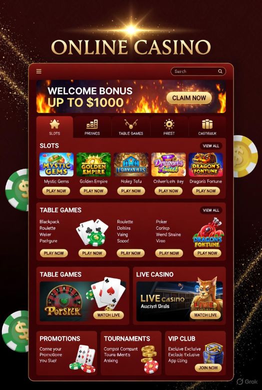
Color choices are rarely random in gambling design. JonBet leans into deep reds, gold accents, and dark backgrounds. Red sparks urgency and excitement. Gold hints at value and reward. Dark shades create contrast that makes bright elements stand out. Together, these choices push attention toward action points like spin buttons and bet sliders.

Calmer tones appear at key moments. Balance displays and menus often use softer colors. This helps players feel stable and in control, even when outcomes are uncertain. The shift between intense and calm visuals mirrors the rhythm of risk and release.

Motion That Feels Alive

Animations play a major role in shaping how chance feels. At JonBet, motion is smooth and paced. Reels spin with weight. Cards flip with a clean snap. Wins trigger bursts of light and movement, even when payouts are small.

This matters because motion rewards attention. Each animation acts like feedback, telling the brain that something meaningful just happened. Losses fade quickly, while wins linger visually. Over time, this imbalance can tilt perception, making play feel more positive than the numbers suggest.

Graphics That Turn Games into Art

Many games on the platform use detailed illustrations rather than plain symbols. Slot themes feature stylized characters, textured backgrounds, and cinematic lighting. Table games use polished surfaces and realistic shadows. These graphics raise the perceived value of each round.

When a game looks crafted, players tend to treat it as an experience rather than a transaction. Risk feels wrapped in entertainment. The line between playing and wagering grows softer, which keeps sessions flowing.

Interface Design and Control

Layout is another quiet influence. JonBet places key controls within easy reach. Bet size, auto-play options, and exit buttons are clear and consistent across games. This reduces mental effort. When decisions feel simple, people make them faster.

Progress bars, timers, and subtle sound cues add structure. They suggest momentum and continuity. Players sense movement forward, even when outcomes vary. This design choice supports longer engagement without obvious pressure.

Risk Framed as Entertainment

The overall effect is a reframing of hazard. Gambling still involves chance, but the presentation feels playful and refined. Visual polish softens sharp edges. Losses look temporary. Wins feel cinematic.

Within the Jon Bet app ecosystem, this balance keeps risk present but less intimidating. Players are encouraged to focus on flow and enjoyment rather than probability. That shift in focus is powerful.

READ ALSO: Responsible Gambling in the Age of Online Lotteries

Why Design Awareness Matters

Understanding visual influence helps players make clearer choices. When people recognize how colors, motion, and graphics guide emotion, they can pause and reflect. Design does not force behavior, but it nudges it.

JonBet shows how thoughtful visuals can turn gambling into a form of digital art. The experience is engaging and polished. At the same time, awareness brings balance. Enjoyment grows when players see both the beauty and the risk.

In the end, the Jon Bet app proves that online casinos are no longer just platforms for wagers. They are designed spaces where art and chance meet, shaping how risk feels with every click.

𐌢